

theScore takes a look at this year’s collection of new kits and breaks down the best and worst designs from Europe heading into the 2022-23 campaign.
The best ?
Arsenal (away)

While the yellow away tops have been wildly popular in recent seasons, it’s impossible not to love Arsenal’s new black-and-gold uniforms. The classic colorway looks good and is accompanied by the club’s famous cannon logo.
Bayern Munich (away)

After 10 straight Bundesliga titles, it’s only natural that Bayern Munich would incorporate some gold into their kits. Like Arsenal’s color scheme, it’s hard to go wrong with the simplicity and fresh look of white and gold.
Crystal Palace (home)
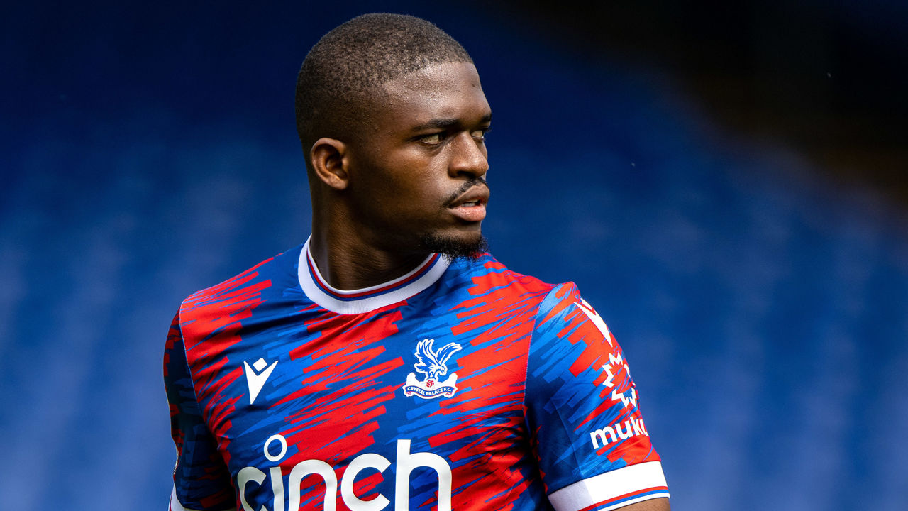
Altering stripes is usually a good way to ruin a club’s traditional look, but Crystal Palace are on to something with their 2022-23 home kits. Uniform manufacturer Macron brought Palace’s classic look to life with an eye-catching crayon-style design, which is also featured on their away and third kits.
Real Madrid (away)

Real Madrid will be one of the sharpest-looking clubs in the world when they hit the road this season thanks to the crisp away kits developed by Adidas. Shades of purple have been used before at Real, but this top could go down as an all-time classic.
Venezia (home, away, and third)
Venezia FC 22/23 collection.#ArancioNeroVerde ???? pic.twitter.com/Q9aB9BFrB0
— Venezia FC (@VeneziaFC_EN) July 26, 2022
Venezia’s new gold kit is fitting for a club that came out on top with the best designs last season. It’s the same story in 2022-23, as the Serie B outift is the undisputed winner of the summer fashion show. Venezia’s trilogy of uniforms will undoubtedly make its way to every football-top lover’s wish list.
The worst ?
Tottenham Hotspur (away)
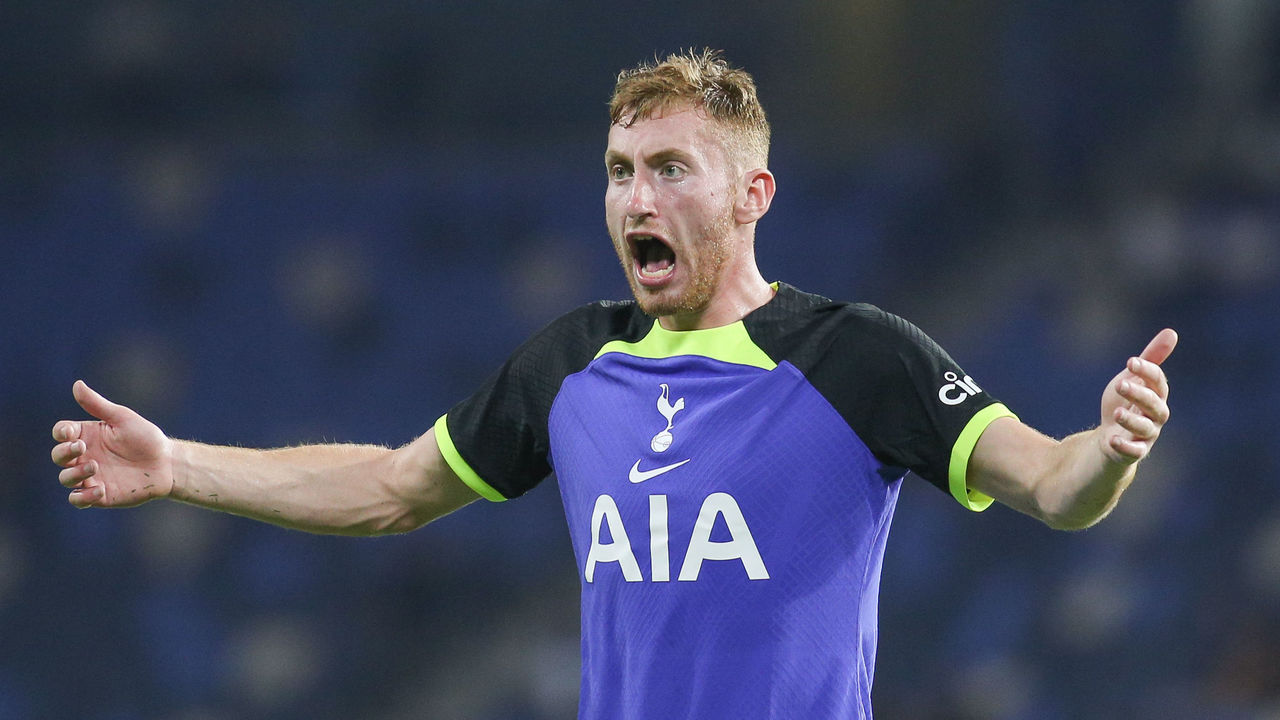
It’s as if Nike handed the reigns over to an intern for Tottenham Hotspur’s away kit. Spurs players will march into visiting stadiums wearing a uniform that looks like it was designed using one of the early versions of EA Sports’ FIFA video games.
Chelsea (home)

Unlike their transfer policy, there’s been a distinct lack of imagination when it comes to developing a home top at Chelsea in recent years. New signings such as Raheem Sterling and Kalidou Koulibaly will be forced into one of the blandest tops in the Premier League when they make their debuts at Stamford Bridge.
Atletico Madrid (home)

Incorporating local landmarks or, say, rivers into the design of football tops don’t always work. Case in point: Atletico Madrid’s attempt to pay homage to the Manzanares river, which ran near their old stadium, has resulted in a dizzying eyesore.
Paris Saint-Germain (home)

Not even the best footballer on the planet can pull this one off. For a team based in one of the fashion capitals of the world, Paris Saint-Germain will parade their star-studded squad out at the Parc des Princes in a top that lacks any kind of imagination or style.
Juventus (home)

Two years removed from their unsightly tire-inspired design, Juventus have come up with a new way to tarnish their famous stripes. Seemingly discontent with keeping things simple, the Old Lady’s home kit is made up of tiny triangles that look like a shoddy stereogram.
Newcastle United (third)
Well that didn’t take long. Just over 6 months after Saudi Arabia buys Newcastle with assurances the club won’t be state-owned or influenced, Newcastle releases a third kit adopting a new colour it previously never used. Wonder where it got the inspo? At least try & disguise it. pic.twitter.com/t9ZngT2w2B
— Arvind Hickman (@ArvindHickman) June 28, 2022
The tweet says it all, really.
